Below are a collection of mapping projects that I have worked on. While this selection does not contain every project, it serves as an evolving gallery that highlights maps produced through coursework, employment and enjoyment.
GIS Analysis
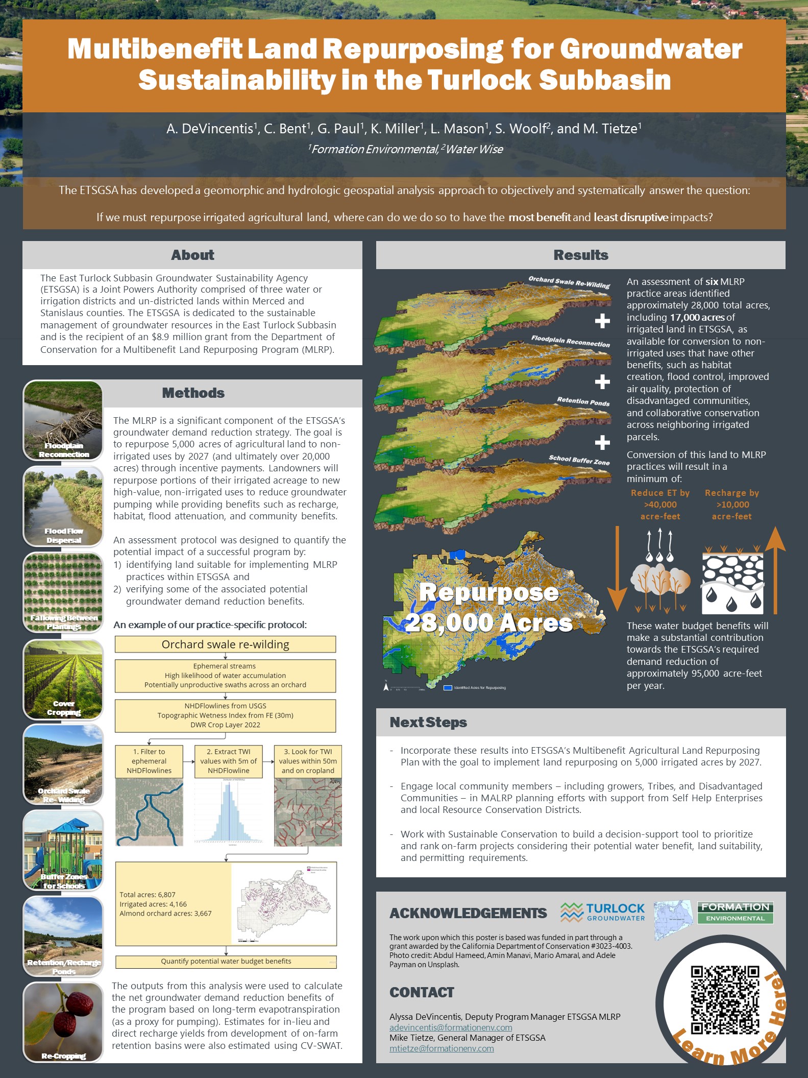
This example highlights my skills in conducting detailed suitability analyses displayed through a research poster and ArcGIS StoryMaps, both of which I created the graphics and maps for. My expertise includes leveraging spatial data to assess and visualize optimal conditions for various applications, ensuring informed decision-making and effective project planning.

Scientific Illustrations
I excel in producing scientific illustrations that effectively communicate complex information. With a keen eye for detail and a strong background in visualizing scientific data, I craft graphics that simplify and enhance understanding of intricate concepts.
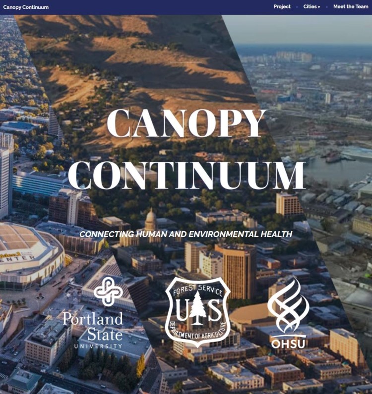
Website Building
The SUPR lab, based at Portland State University, hired me to design and create the website for a project called Canopy Continuum. The website, icons and maps were produced using Adobe Creative Cloud, WordPress, and ArcGIS.

ArcGIS StoryMaps
This story map was a preliminary look at tree canopy versus temperature in 5 cities for the Canopy Continuum project initiated by the SUPR lab. The story map allows the user to use a slider tool to see the difference between tree covered areas and temperature differences throughout the cities.

ArcGIS StoryMaps
This story map takes a look at tree removals tracked by Portland’s Title 11 Tree Code. The map takes a dive into where trees are planted and where trees are removed and shows variation throughout the community. This project was created from data sourced by the SUPR lab for a Portland Community College course.

Media Presence
This map was featured in the Portland Business Journal in the article, “Portland’s hottest hoods have little in common with coolest hoods” by Elizabeth Hayes. The SUPR lab provided me with a raw temperature raster showing the real-time air temperature on a hot day in Portland, OR. I designed and analyzed the information as shown above using ArcGIS Pro.
Also referenced in:
Portland Parks Foundation Event
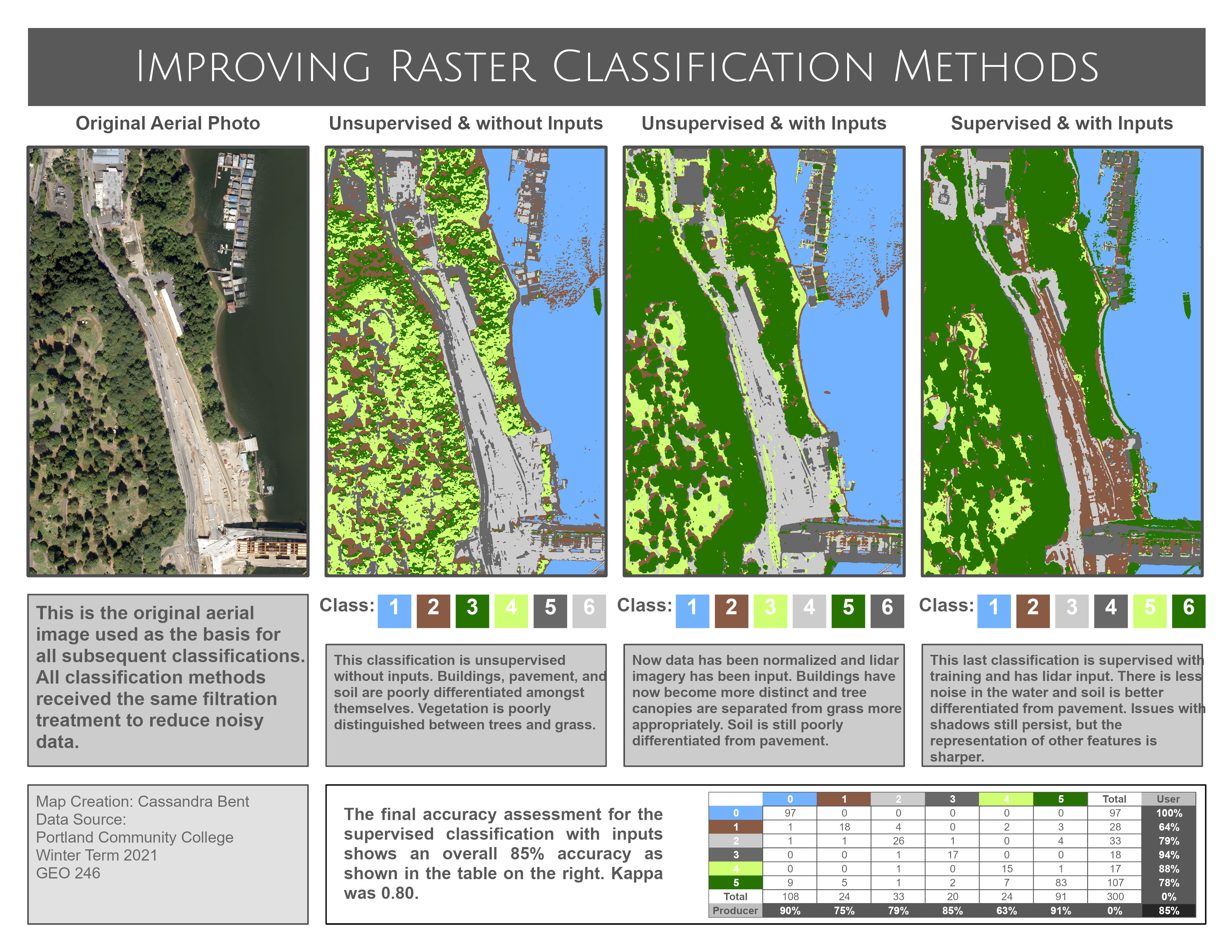
Aerial Imaging and Machine Learning
This project was part of a remote sensing tutorial with Portland Community College. The aim was to compare supervised versus unsupervised classification techniques to an aerial image. Through training, the supervised classification with LiDAR input shows the best accuracy for identifying classified objects in the image.

Data Analysis and Illustrator
The above infographic was created as part of work associated with the SUPR lab based at Portland State University. The information uses publicly available information, which includes census demographics, canopy coverage, and removed trees recorded from Portland’s Title 11 tree code. The infographic shows choice locations to highlight higher to lower income areas. The proportion of trees removed compared to the tree canopy coverage is indicated by the tree stump. This is part of a preliminary dive into how tree removal may be affecting areas with varying tree cover. Icons were created using Adobe Illustrator and the map was created using ArcGIS Pro.

Python Scripting
This isn’t a map, but it does show an example of my work from the GIS Programming course with Portland Community College. We would created a Python Script tool for ArcGIS pro. This project calculated canopy volume from Portland’s Parks Tree Inventory using the columns that housed information regarding diameter, height, condition, and crown base height.

Thesis Poster
This poster represents the culmination of my graduate studies work and was presented at the 68th ASEV National Conference. Photoshop, R, SigmaPlot, and Excel were used to process and present data generated from plant harvesting and the image analysis system, WinRHIZO.
Referenced here:

Print Media
I specialize in creating informative and visually appealing infographics and charts designed for flyers and printable media. These graphics are crafted to be both engaging and easily comprehensible, ensuring key information is conveyed effectively.
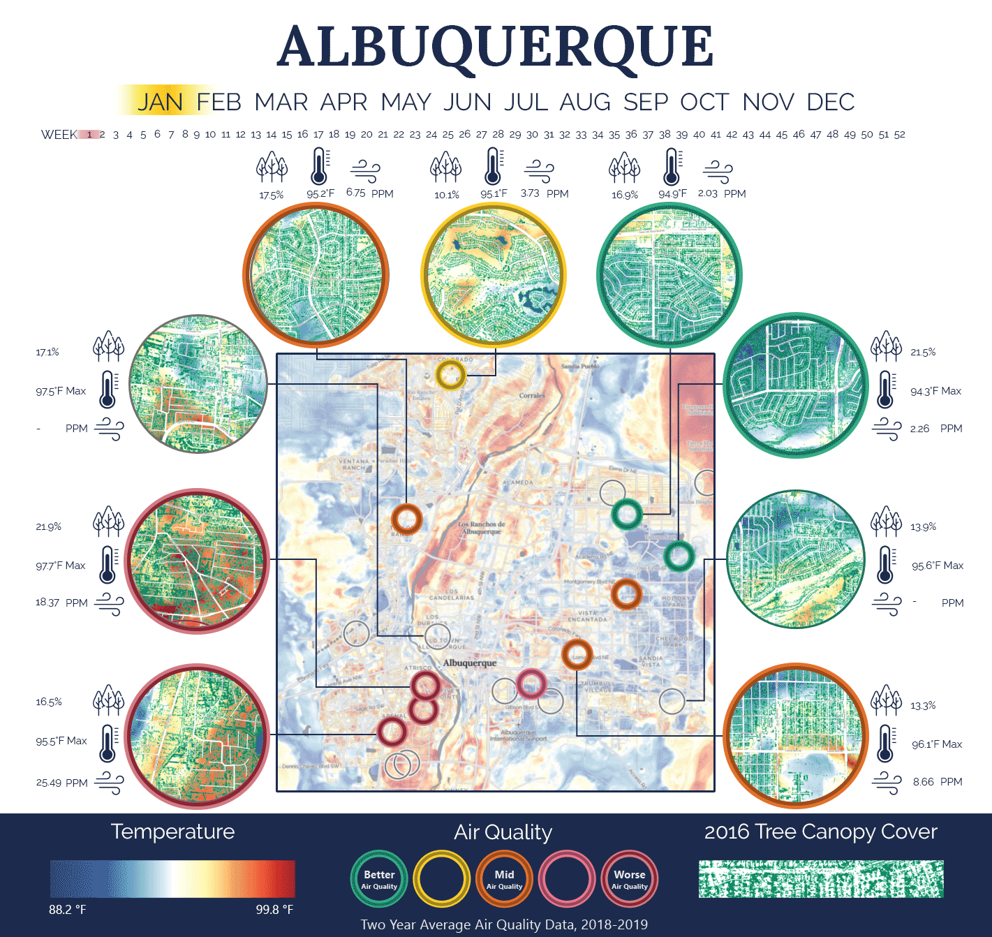
Photoshop Animation
This map animation was created as part of the Canopy Continuum Project led by the SUPR lab based at Portland State University. This map incorporates temperature, air, and canopy cover over time. This map style was created for Albuquerque, Portland, Boise, Tacoma, and Sacramento. This animation was created using Adobe Photoshop, Adobe Illustrator, and ArcGIS Pro.
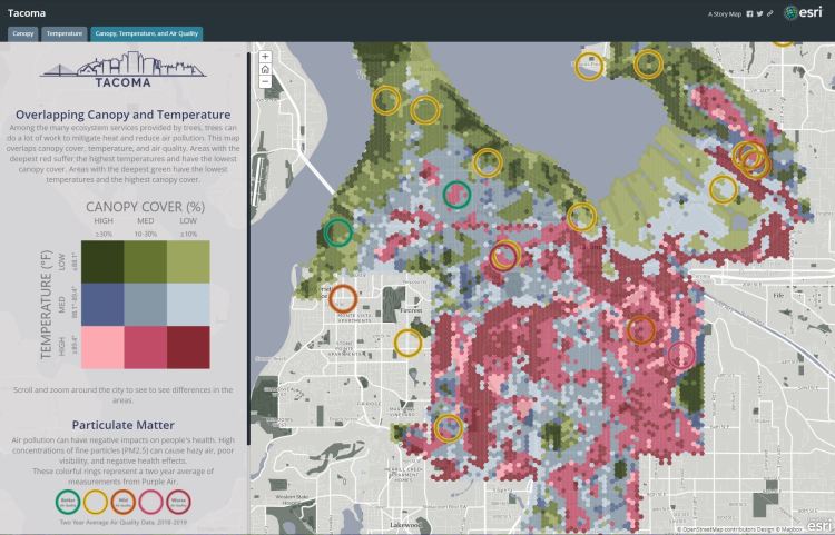
Interactive Web Maps
This interactive map was created as part of the Canopy Continuum Project led by the SUPR lab based at Portland State University. This map incorporates temperature, air, and canopy cover. This map style was created for Albuquerque, Portland, Boise, Tacoma, and Sacramento. This map was created using ArcGIS Online.

NDVI and LiDAR Analysis
The above project integrates NDVI and LiDAR to attempt to assess tree growth between 2014 to 2019. This is a final project that was part of the requirements for the remote sensing course with Portland Community College.
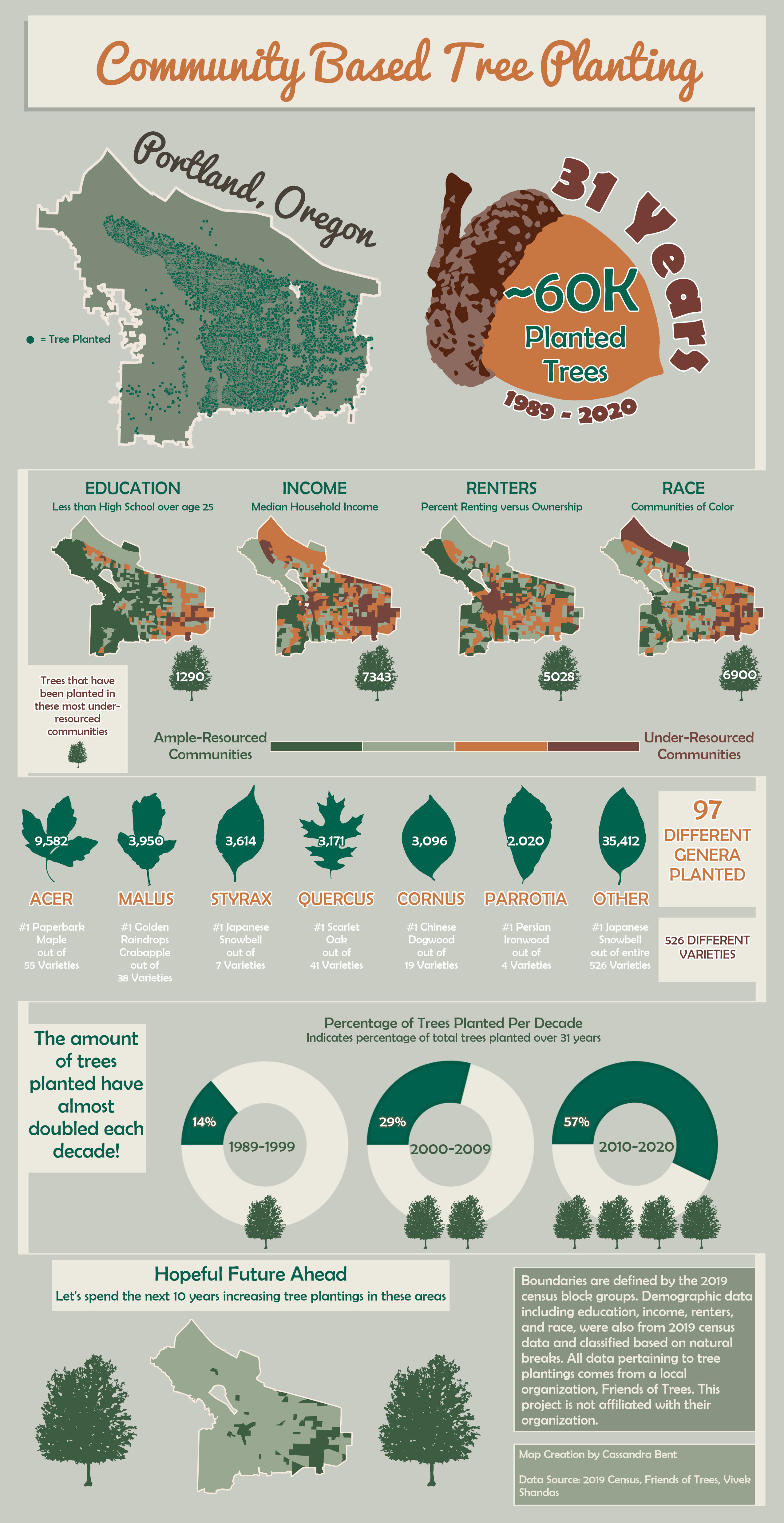
Data Analysis and Illustrator
This infographic was created using planting data from Friends of Trees. Using excel, approximately 60k trees with varying common names were re-identified with the Genus. The above infographic was created using this file, illustrator, and ArcGIS Pro.

Data Analysis and Illustrator
There is a publicly available list of Oregon residents that died during the 2021 heat wave. Using their addresses, names and dates of death, information regarding their building type and age could be determined. This infographic was created as part of a project with the SUPR lab based at Portland State University. The above images and maps were created with Google Earth, ArcGIS Pro, and Illustrator.
Referenced in:
Portland Parks Foundation Event

Raster Analysis
This project is an example of surface temperature raster analysis and was completed as part of the remote sensing course with Portland Community College.

Cartography
This map may highlight my finest cartography work. It is very different from anything I have done and takes a light hearted approach to mapping winter activities at Crater Lake. This map was created as part of the Cartography class at Portland Community College.
